Abstract
The Covid-19 pandemic has been a global issue for well over two years. However, recent reports suggest that it may end with health officials claiming to treat it as a “seasonal” endemic. Therefore to test the accuracy of these claims, our research runs to time and spectral analysis on eight countries’ Covid-19 time-series data. Our results reveal that the northern and southern hemisphere countries exhibit a series of outbreaks at the same time, strongly implying that there is no seasonal effect. In addition, it also shows that outbreaks tend to occur bi-annually, which also shows that it is still a pandemic. Therefore our data/analysis is potentially controversial as it disagrees with health officials, and we strongly suggest it is premature to claim an end to this pandemic.
Keywords
Spectral Analysis, Fast Fourier Transforms, Signals Processing, Covid-19 Time series analysis
Introduction
As of today, the Covid-19 pandemic has stretched out for over two-plus years. Moreover, major news outlets have recently made the bold claim that the Covid-19 “pandemic” is ending. In December 2021 CDC director Rochelle Walensky said, “We have seen now that this is likely to become a seasonal endemic disease here in the United States and around the world” [1]. This news headline is among many globally claiming an end to the pandemic and a start to an endemic. Many local governments have since acted upon these claims by lifting mask mandates and returning to normalcy. However, we are interested in challenging these claims to see if this is indeed the direction in which this global pandemic is trending. Luckily with the accumulation of 2 years of daily case data, we can test these claims using mathematical analysis tools to assess our current status. So in this paper, we wish to explore the following questions: Is there a seasonal trend in the COVID-19 pandemic? If so, can we call this a seasonal endemic, as the CDC suggests?
In order to answer this question, we first must define what a “seasonal endemic” and “pandemic” is. In the context of this paper, we will define a seasonal endemic as a disease outbreak that occurs consistently in a limited season. By contrast, we will define a pandemic as a disease outbreak that is prevalent globally at any time. So in order to arrive at an answer, we wish to explore the COVID-19 cases time series data of 8 countries (4 from the northern hemisphere & 4 from the southern hemisphere) and see whether there tends to be “Covid spikes” in specific seasons. Through these Covid spikes, we will determine whether they satisfy the conditions of an endemic or a pandemic. In order to collect our data, we plan on running Fourier analysis to extract periodic trends and apply them with context to our time series data.
Spectral Analysis
What is spectral analysis? In the simplest terms, it is a method of observing spectra that appear within frequencies. [2]. Especially when modeling pandemics, time-series data tends to show a periodic behavior. For this reason, our main objective is to get our data into spectra to measure the magnitude of input versus just a signal frequency. However, to do so, we must first understand the difference between the time and frequency domains. The time domain is typically some dynamical system that generates an output within an evenly spaced amount of time. In terms of our data, we are explicitly counting the recorded weekly cases. Next, we have the frequency domain, an analytical space in which “signals.” Alternatively, “impulses” are conveyed in terms of frequencies.
The main advantage of observing our data in the frequency domain is that Covid-19 data contains noise. Noise is often associated with entropy or uncertainty, meaning there is some data corruption [3]. Unfortunately, Covid-19 data is among some of the noisiest data, and we need a better way to see patterns within our time series data. So while we can observe Covid spikes in the time domain, we may not truly understand the trends of Covid-19 in this general approach. Especially since Covid cases are very subject to how much testing is done, whether the test is accurate (false positives, false negatives), and how cases are not reported on weekends; we see our data fluctuate substantially from week to week. Therefore using spectral analysis, we get the advantage of observing strong periodic impulses you cannot get from a time series approach. Hence, we can use this method to see whether there is a seasonal effect of Covid-19.
Mathematical Background
We now provide more detail about the methods by which we will obtain our results. In this subsection, we will discuss Discrete Fourier Transforms (DFT), Fast Fourier Transforms (FFT), and the Power Spectrum Density (PSD).
Discrete Fourier Transform
The fundamental concept behind the Discrete Fourier Transforms is that it takes a data set instead of a function like your typical Fourier Transform. Because we are working with a time series, all the numbers are given. In a function, we have a determined value governed by the dependent variable. In a Discrete Fourier transform takes a data set and transforms it into another data set that contains the Fourier coefficients. The Fourier coefficients are computed in the following way:
\[ X_k = X_0, X_1, X_1, X_2, …… X_N, \] \[ X_k = \sum_{n=0}^{N-1} x_n e^{\frac{-2 \pi i (kn)}{N}} = \sum_{n=0}^{N-1} x_n [\cos(\frac{2 \pi kn}{N})-i \sin(\frac{2 \pi kn}{N})] \]
N is the total number of samples, and n is the current sample. We also see the value k, the current frequency within the boundaries \( k ∈ [0, N − 1] \), and xn, which is the current sample value. With all those parts we compute the vector \(X_{k}\) which produces a complex number \( (a + ib) \) whose entries are what’s being shown in summation equation.
Fast Fourier Transform
Now that we have laid out the mathematical foundation, we need to discuss how we get these results numerically. To that, we introduce the Fast Fourier Transform (FFT), which is one the most prominent algorithms that compute the DFT’s of any given time series data. This algorithm is a divide and conquer algorithm, where it divides up the signal into smaller signals, computes the DFT of the smaller signals, and joins them together. We, therefore, define \(W\) as our complex number to simplify the Discrete Fourier transform equations:
\[ W = e^{\frac{2 \pi i}{N}}. \]
Doing so yields a similar equation to that of the Discrete Fourier Transform. The Fast Fourier Transform can be seen as the following:
\[ X_k = \sum_{n=0}^{N/2-1} W^{kn} x_n + \sum_{n=0}^{N/2-1} W^{kn} x_n. \]
To compute the FFT, we would perform two separate matrix-vector products of the \( x_{n} \)’s vectors multiplied to a matrix whose \(k\) and \(n\) elements is the the power to the W . This matrix-vector product results into another vector whose entries are the \(X_{k} \) values [9]. Danielson and Lanczos created this numerical method in which splitting up our DFT into two separate DFTs \( (N/2) \)and summing them would produce the same result compared to one giant DFT. This completely changes the time complexity of such computations where a DFT is \(O(n^{2})\) while a FFT is \(O(n log n)\). This nearly linear time complexity was a breakthrough, and this algorithm is one of the most widely used and prominent algorithms of the 20th century
Power Spectrum Density
Last, we want to talk about the Power Spectrum Density (PSD). A power spectrum \(S_{xx}(f) \) of a time series \(x(t) \) describes the distribution of power into a frequency that shows up in the form of a signal/impulse. [5] It is a popular method in Fourier analysis, and we can use it to see physical signals that are shot up over a periodic range. We care about the PSD because it will reveal frequencies with the largest power to identify dominant periodic signals. Therefore in the context of our paper, we are looking to see what periodic signals (spikes) we can see within a range of time (seasons). The following can be computed with the below equation
\[ \text{PSD} = (\frac{1}{\omega*\text{len(covid data)}}) * abs(\text{X})^2 . \]
However, this still does not overcome our noise problem. In previous sections, we emphasized how noisy Covid-19 data was. Even when converting it to a frequency domain, some noise can bypass the mitigation process and appear in our periodicity data. For this reason, many impulses are shot up in our PSD. However, what is misleading is that almost all these signals are minimal minus one or two impulses. So a famous trick in signal processing is to “denoise” our data by setting some threshold that will drown out those tiny signals. We decided to drown out these mini signals because by doing so, we are killing the noise that may have gotten through [8]. This makes a clear and more straightforward interpretation and will help analyze the possible seasonal trends we might see in the Covid-19 data.
Data Availability
We obtained the Covid-19 time-series data from John Hopkins University’s Center for Systems Sciences and Engineering. We used Covid cases data from March 5th, 2020 up until February 7th, 2022. We used a start date of March 5th because most countries did not experience a patient zero until then. In order to see whether there is some endemic-like behavior, we must consider the difference in seasons that occur naturally from the northern and southern hemispheres. Therefore we take a deeper look into four countries from each respective hemisphere: Argentina (Southern), Brazil (Southern), India (Northern), Indonesia (Southern), Russia (Northern), South Africa (Southern), United Kingdom (Northern), & The United States of America (Northern). The selection of these countries was mainly motivated by their population size and the countries that experienced the worst outbreaks during Covid. With our original hypothesis that winter is the worst for infections, we want to see whether these claims are valid within both hemispheres.
Methods
First, we took our daily cases time series and converted it into a weekly time series. We did this to mitigate some early noise within the data. Computationally we achieved this by writing a basic python script that would extract the data from the CSV files and store the dates and case counts in separate lists. We repeated this process until we extracted each country’s daily case counts. Next, we converted our daily case counts to weekly. We accomplished this by simply taking the summation of the case numbers and storing this in another list. We reset our summation every time our index hits a modulus of 7.
We then ran the Fast Fourier Transform (FFT) algorithm on our weekly time series data to get it into a frequency domain. We used the SciPy inbuilt FFT routine to extract the frequency power spectrum. Our python script and all our data are stored on GitHub and linked below the title.
Results & Discussion
Northern Hemisphere
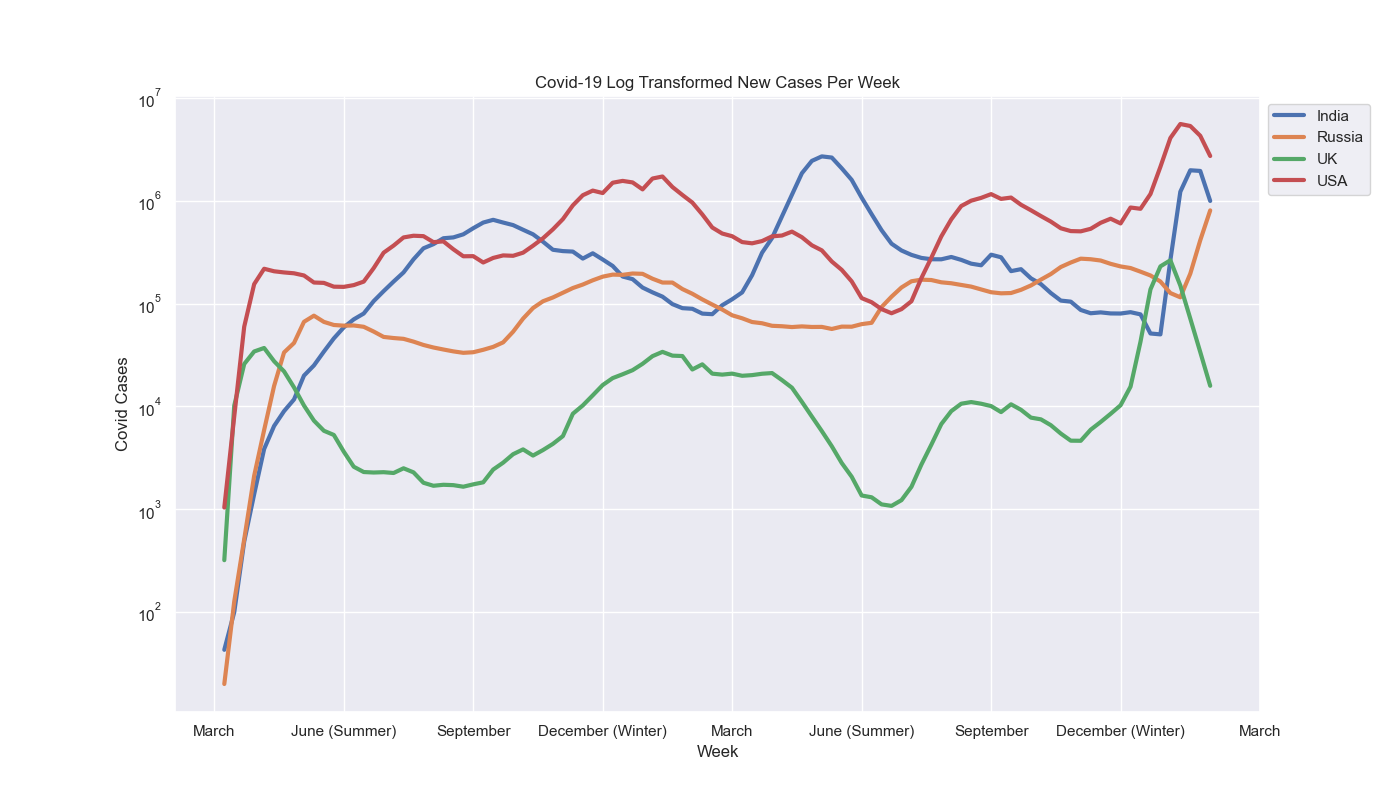
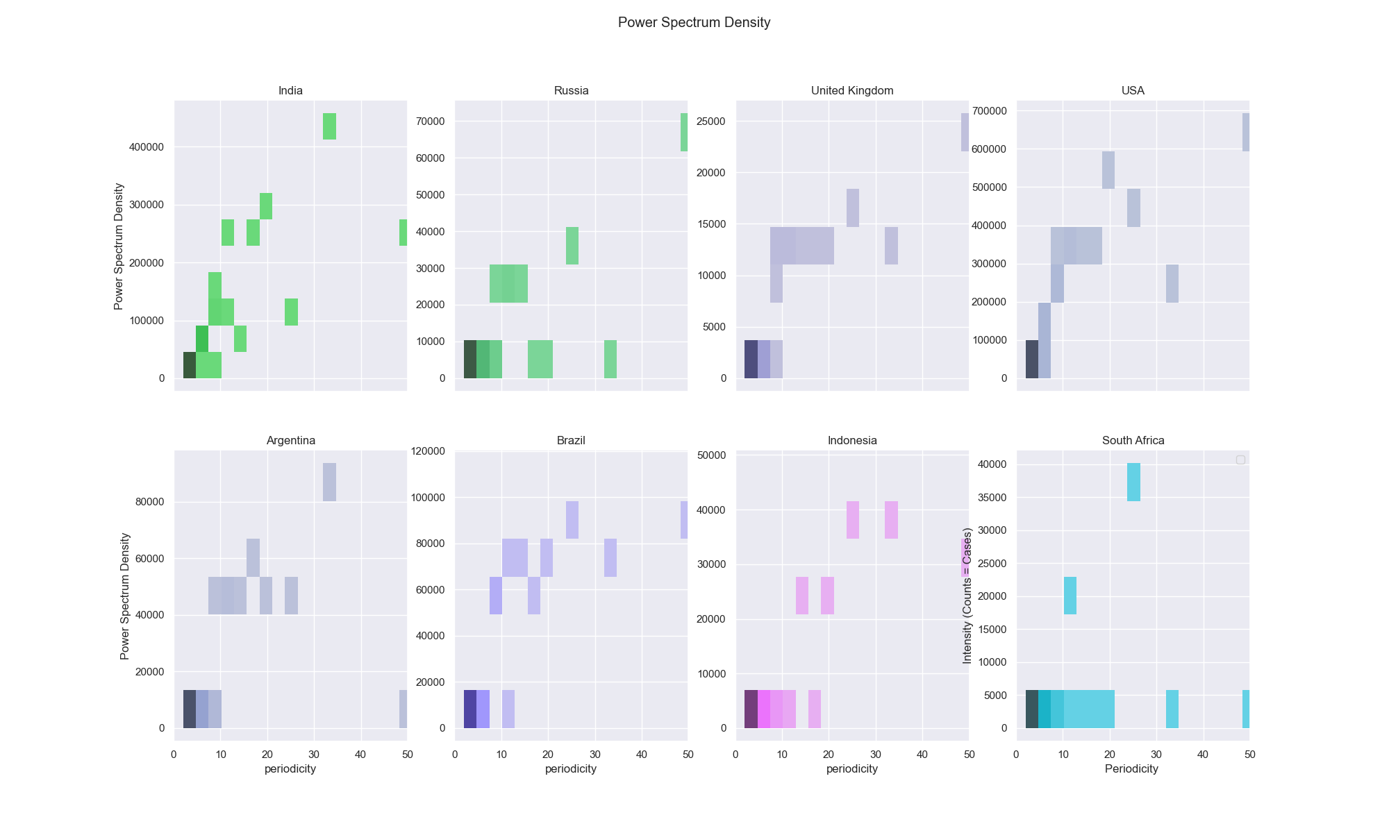
Figure 3 shows our plots of our Power spectrum for each of the eight countries selected. Before we begin to analyze the trends, let’s first begin by defining seasons. Starting from March 1st to May 31st we define this as the spring season. From June 1st to August 31st we define this as the summer season. From September 1st to November 30th we define this as the fall season. And lastly, from December 1st to February 28th we define this as the winter season. (These seasons were marked in Fig. (2) on our xtick labels)
The time-series of our original Figure 1 reveal a number of interesting features. Within each country, we see varying levels of Covid Spikes. Therefore, this most recent surge in cases during winter 2022 makes the spikes occurring in winter 2021 look smaller. For these reasons we plotted our time-series in by applying a log transform normalization divided into their respective hemispheres to get a better visual of these Covid cases. From a visual standpoint, we can see that Covid-19 has hit all the countries hard during the winter 2021 and 2022 seasons with the exception of India. However, to our surprise, there also appears to be a “secondary” season in which Covid spikes. To see this more quantitatively we now look at the power spectra of the United Kingdom.
In the United Kingdom, an impulse peaks at 50 weeks. This data is suggesting that there will be a Covid spike every 50 weeks. If we apply this knowledge to the time-series graph, we see that roughly every 50 weeks, we do indeed get a Covid spike. In our original iteration of this project we drowned out the “insignificant” signals from our analysis. However due to an unclarity of which were insignificant, we decided to keep the natural “signals” that appear within each Power spectrum density subplot seen in Fig. (3). We can interpret the bins as the densities at which they were peaking. So a lot of this early data suggests that we are getting clear signals from each country.
However, we also want to point out the interesting observation that the power spectrum for several of the countries contains two clear peaks around 50 weeks (1 year) and 25 weeks (6 months). This appears to be the case for the UK and USA for the northern hemisphere. This highly implies that the ”seasonal endemic” argument is wrong. If we were to see a singular signal occurring around the 50 week mark (1 year), this would strongly inform us that this pandemic occurred only in the winter. However we know that with the periodicity of 25 weeks (6 months), that this is telling us that these spikes occur bi-annually.
In a previous paragraph we stated that all the northern hemisphere countries we analyzed had a period- icity of 25 weeks except India. For these reasons, we’d like to observe India in much deeper context. India has a singular power spectrum that occurs every 30-35 weeks (roughly 7-8 months). Though there is not a specific season in which peaks occur, this data still implies that the “seasonal endemic” argument is wrong. So although there is no “bi-annual” trend in India, we still know that India does not exhibit the conditions of an endemic.
Southern Hemisphere
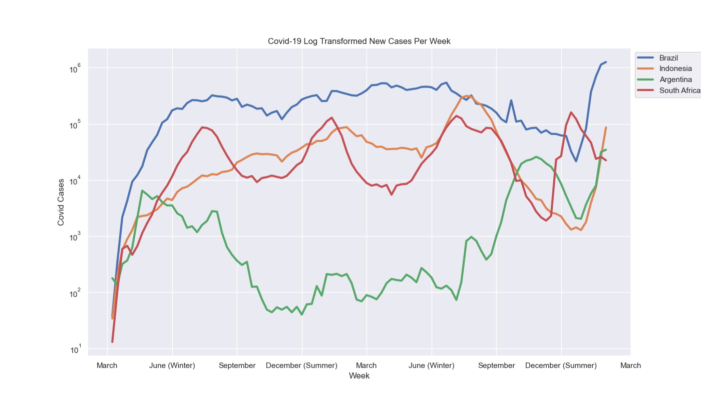
Next, we examine the southern hemisphere, which has the opposite seasons from the northern hemisphere. Therefore, we define the seasons in the following way: Starting from March 1st to May 31st we define this as the fall season. From June 1st to August 31st we define this as the winter season. From September 1st to November 30th we define this as the spring season. And lastly, from December 1st to February 28th we define this as the summer season. These changes are reflected by the vertical lines seen on the time-series graphs.
With that, we can take a look again at Figure 3 and notice sort of an “inverse” behavior of the northern hemisphere. Nearly every country observed except Indonesia has experienced its worst Covid spike in this current summer 2022 season (northern hemisphere winter). This property of having a correlation in spikes at the same time between the northern and southern hemisphere regardless of season shows that it fits the conditions of a pandemic. This correlation of Covid cases lines up with the timeline of the world when the Omicron variant in particular was very prevalent. However, what we can see is that Brazil, Indonesia, and South Africa all have a power spectrum that peaks at around 25 weeks. Though not entirely clear in all the time-series graph, we can see that in these countries there is a “bi-annual” spike occurring in the winter and summer seasons. The one country with an exception was South Africa, who has the most beautiful depictions of this bi-annual behavior, as we can see the Covid spikes are very well defined. With all that, this data backs up our claim once again, that it is not a seasonal endemic and we can clearly see this behavior occur across the world. We arrive at this claim by emphasizing the correlation we see between the northern and southern hemispheres experience spikes at the same time.
Meanwhile, we also have Argentina, which has a periodicity of around 30-35 weeks, which is comparable to that of India from the northern hemisphere. Though there is no connection between the two countries as to why they occur, we do want to acknowledge that they do exhibit the same behavior. This 33-week recurrence provides insight that although there isn’t a particular season in which Covid cases spike, there is indeed a periodicity that shows that Covid outbreak does make reappearances in its timeline. This is rather important to note because a lot of governments around the world are thinking along the lines of CDC director Rochelle Walensky, but we believe it is very premature to begin claiming an end to the pandemic. In the southern hemisphere, we see a majority of impulses are spiking every 25 weeks, and in the case of Argentina every 33 weeks. This means that roughly every 6 months (8 months for Argentina), there appear to be a Covid outbreak. Therefore our data suggests that like the northern hemisphere, the southern hemisphere displays conditions like a pandemic with no particular season being the worse across the world.
Discussion
With all our data accumulated, we can genuinely address whether there is a seasonal trend within the pandemic. With that, we disagree with the claim that this is endemic. The latest Omicron variant wave taking an extreme toll on cases worldwide shows that Covid-19 is a pandemic. Though some countries had localized outbreaks that differed in periodicity in the case of Argentina \& India, we found that all the countries had no seasonal effect within our data. In many cases, countries experienced a peak at around 25 weeks, and in some cases, we experienced peaks at 33 weeks. We were surprised by these results because if it were indeed an endemic, we would see a periodicity of around 52 weeks (1 year).
In light of these results, we wanted to discuss some context to these periodic trends. The two most transmissible variants up to this point have been the delta (May 2021) and omicron variants (November 2022). They originated from India (delta), and South Africa (omicron), and we emphasized studying these two countries for these reasons. At this point in the pandemic, there were no travel restrictions aside from Covid testing, and these variants had spread globally, leading to spikes around these times. Therefore, we know that if current trends continue based on the power spectra, we can be on the wrong side of the pandemic once more. Especially with the lifting of mask mandates across many counties, we believe this will yield another possible Covid outbreak from June through August. Consequently, by lifting restrictions, we believe that another variant can appear in the near future.
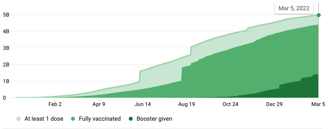
While we firmly believe this is not endemic, we would like to mention a caveat of our research. It is safe to say that covariates within our data are not considered. The major one is the protection we get from vaccines. Though we did not do any mathematics with the vaccination data, these are considerations we can make in future works. The effects of the vaccine are very substantial because they widely affect how we react to this virus. So in Figure 4, we see that a little less than half the population is still not vaccinated. This future research would require daily vaccination time series, accessible from Github. In addition, we could see the vaccination counts concerning the country’s population to assess how lethal the virus is based on the rate of vaccinations. So knowing that a little under half the population remains unvaccinated and that our research has assessed Covid-19 as a pandemic, we should keep a level of caution and not let our guard down for the time being.
Concluding Remarks
With all that, we stand with the data that does not support classifying Covid-19 as a seasonal endemic. With our most recent outbreak being the worst one, we believe these new lackadaisical policies will lead to future outbreaks and continue to follow this pandemic-like behavior. In the meantime, we can follow the World Health Organization (WHO) guidelines and keep up with the latest new variants that may appear (i.e., BA.2 Omicron). Though we are tired of the pandemic, it is safe to say that it is not over and possibly will continue for an extended time.
Code
“figures “- the folder where figures are saved.
“north “- folder of all of the northern hemisphere data
“south “- folder of all of the southern hemisphere data
“Covid.ipynb “- a jupyter notebook of analysis.py. Just easier to run
“analysis.py “- generates all data for analysis.
“time-series-19-covid-combined.csv “- original file where data was scraped from
How to run code
There are two ways to run the program: (1) Jupyter Notebook & (2) Unix based.
- Run the jupyter notebook
Covid.ipynb
2.Run the python file via Unix
python3 analysis.py
References
[1] https://www.washingtonpost.com/wellness/2022/01/20/what-does-endemic-mean/
[2] http://web.stanford.edu/class/earthsys214/notes/series.htmlspectral-analysis
[3] https://www.techtarget.com/searchbusinessanalytics/definition/noisy-data
[4] Bochner, S.; Chandrasekharan, K. (1949), Fourier Transforms, Princeton University Press.
[5] P Stoica R Moses (2005). “ Spectral Analysis of Signals” (PDF).
[6] https://www.nytimes.com/live/2021/04/26/world/covid-vaccine-coronavirus-cases
[7] https://ourworldindata.org/covid-vaccinations?country=OWID WRL
[8] https://eeweb.engineering.nyu.edu/iselesni/DoubleSoftware/signal.html
[9] William H. Press … [and others]. Numerical Recipes in C : the Art of Scientific Computing. Cambridge [Cambridgeshire] ; New York :Cambridge University Press, 1992.